
As a font-end developer, new or seasoned, you’ve probably heard of, come across, or already used Tailwind CSS, a popular low-level utility-first CSS framework that has transformed the way we think about user interfaces.
Unlike other frameworks that come bundled with predefined styles and components, Tailwind CSS takes a different approach. The low-level utility-first feature enables you to mix and match classes to create unique designs without bloating your code with unncessary CSS rules, which accelerates development process, gives developers complete control over their designs, and keeps your codebase clean and manageable. With Tailwind CSS, developers in teams can maintain a consistent code design that favors team collaboration.
Moreover, Tailwind CSS automatically removes all unused CSS when building for production, making your final CSS bundle the smallest it could possibly be.
Its customization and theming features empowers developers to craft visually stunning applications to their own taste and design concept.
While Tailwind CSS provides you with building blocks and some basic styles of your web design, there are many UI kits and components libraries built based on top of Tailwind CSS available out there that ship with decent styles for you to use right away, regardless of your design experience and CSS skills.
In this post, we’ve curated an extensive list of the best free Tailwind UI kits and components libraries, and categorized them into 3 distinct types: As A Tailwind CSS Plugin, JavaScript Dependent, and Ready-To-Use Copy & Paste Code Snippets. Each has their own unique advantages, whether you are looking for dynamic features of certain components or ready-made code templates.
Whichever option you choose, these resources will help streamline your design process, making it easier than ever to bring your creative design to life. Let’s dive right in and explore these top creatively crafted Tailwind-Based UI Kits and Components Libraries and see how they can enhance your next project.
We assume you’ve already installed
tailwindcsspackage as all these UI kits and components require Tailwind CSS pre-installed. If you haven’t already, execute below command in your terminal to install it.
- For V4:
npm i tailwindcss- For V3:
npm i tailwindcss@3For specific setup like Vite, PostCSS, Various Frameworks or CDN, check this installation guide.
The main difference between As A Tailwind Plugin and Javascript Dependent is the way JavaScript or CSS files are included. Of course, this involves complicated Tailwind CSS internal mechanism in terms of the differences between using @source and @plugin, as well as including these files using <style> tag or <script>, and that’s not something we are going to talk about here.
As A Tailwind CSS Plugin
These UI kits and components libraries are used mainly as Tailwind CSS plugins whose prominent characteristic is using @plugin in the main Tailwind css file. However, this doesn’t mean, using @plugin is all that is required, each UI kit differs in the way they work, take Flowbite and FlyonUI for example, they both require additional JavaScript files for their interactive elements to function.
1. DaisyUI
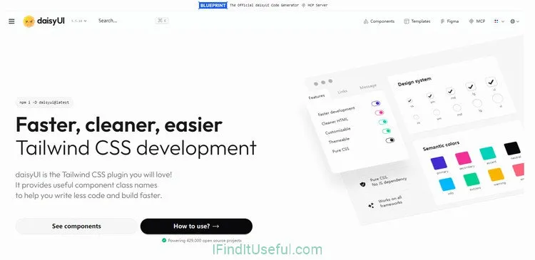
DaisyUI is a really interesting player in the Tailwind CSS ecosystem, and quite different from pure Tailwind class libraries. Instead of just giving you raw, pre-styled Tailwind classes, DaisyUI acts as a plugin that enhances Tailwind. What this means is that you use semantic class names like btn, card, or alert in your HTML, and DaisyUI, running as a Tailwind plugin, translates those into actual Tailwind utility classes behind the scenes, which drastically reduces the number of code. This approach makes your HTML super clean and readable, especially for common patterns.
The standout feature of DaisyUI is its simplicity, both the way of using it and the codebase. Also DaisyUI tries to illustrate how its components are structured and realized, which makes perfect sense to users how the underlying mechanism works.
Tailwind CSS Version: V4
Installation: Package managers DaisyUI supports: NPM, PNPM, Yarn, Bun, Deno.
npm i -D daisyui@latest- Using DaisyUI: Just one line of code.
@import "tailwindcss"; /* tailwindcss needs to be above daisyui. */

/*  This is the only line of code needed. */
@plugin "daisyui";- JavaScript: No JavaScript needed!
2. FlyonUI
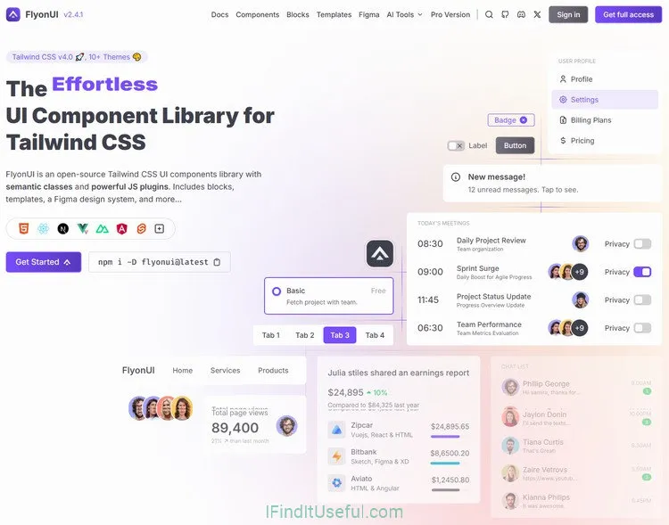
FlyonUI is an open-source Tailwind CSS UI components library with utility classes and powerful JS plugins. Includes blocks, templates, a Figma design system, and more.
FlyonUI brings together the beauty of ready-made semantic classes and the interactive headless JavaScript plugins, offering you a powerful toolkit to build stunning, interactive user interfaces with ease and save countless hours.
If you’re building with Tailwind CSS and looking for a way to quickly assemble modern interfaces, FlyonUI is a great option to consider.
Tailwind CSS Version: V4
Installation:
npm install flyonui- Using FlyonUI:
@import "tailwindcss";
@plugin "flyonui";
@import "./node_modules/flyonui/variants.css"; /* Require only if you want to use FlyonUI JS component */

@source "./node_modules/flyonui/dist/index.js"; /* Require only if you want to use FlyonUI JS component */

/* Or to include specific js component: */
@source "./node_modules/flyonui/dist/accordion.js";
Or you may include FlyonUI JavaScript in your HTML:
<script src="../node_modules/flyonui/flyonui.js"></script>

/* Or to include specific js component: */
<script src="../node_modules/flyonui/dist/accordion.js"></script> - JavaScript: Refer to above on how to use FlyonUI.
3. Flowbite
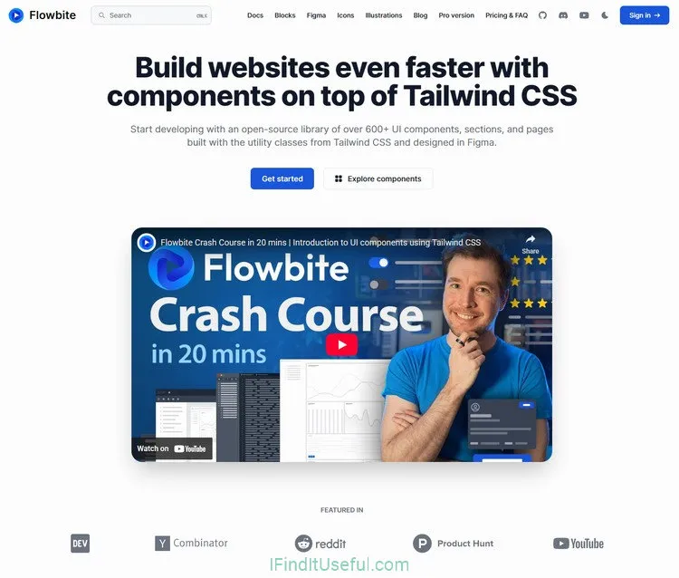
Flowbite is an open-source library of UI components based on the utility-first Tailwind CSS framework featuring dark mode support, a Figma design system, templates, and more.
It includes all of the commonly used components that a website requires, such as buttons, dropdowns, navigation bars, modals, but also some more advanced interactive elements such as datepickers.
All of the elements are built using the utility classes from Tailwind CSS and vanilla JavaScript with support for TypeScript.
It’s worth mentioning that you can now empower your LLM (Large Language Model) providers to improve the quality of UI generation in code with Flowbite MCP server by adding the right amount of context, whether the code is HTML, React, Svelte, or other frameworks or languages.
Tailwind CSS Version: V2, V3, V4.
Installation:
npm install flowbite- Using Flowbite: Flowbite is also used as a Tailwind CSS plugin.
/* choose one of the following */

@import url('https://fonts.googleapis.com/css2?family=Inter:wght@300;400;500;600;700;800&display=swap');
@import "flowbite/src/themes/default";

/* MINIMAL THEME
@import url('https://fonts.googleapis.com/css2?family=Open+Sans:ital,wght@0,300..800;1,300..800&display=swap');
@import "flowbite/src/themes/minimal";
*/

/* ENTERPRISE THEME
@import url('https://fonts.googleapis.com/css2?family=Shantell+Sans:ital,wght@0,300..800;1,300..800&display=swap');
@import "flowbite/src/themes/enterprise";
*/

/* PLAYFUL THEME
@import url('https://fonts.googleapis.com/css2?family=Google+Sans+Code:ital,wght@0,300..800;1,300..800&display=swap');
@import "flowbite/src/themes/playful";
*/

/* MONO THEME
@import "flowbite/src/themes/mono";
*/


/* Plugins */
@plugin "flowbite/plugin";

@source "../node_modules/flowbite";- JavaScript: JavaScript in flowbite package for interactive elements in your
<body>tag.
<script src="../path/to/flowbite/dist/flowbite.min.js"></script>Go to FlowbiteSince Flowbite has an extensive integration guides for various languages and frameworks, you should check them out if your project uses one of them.
JavaScript Dependent
When saying JavaScript Dependent, it doesn’t really mean the UI Kit or all components require JavaScript to be able to function, it does mean some of the components, especially interactive features like dropdowns, modals, carousels, etc, require certain kind of JavaScript library or vanilla JS to function properly. In fact, most of the components in these UI kits and libraries work without any JavaScript setup.
1. Preline UI
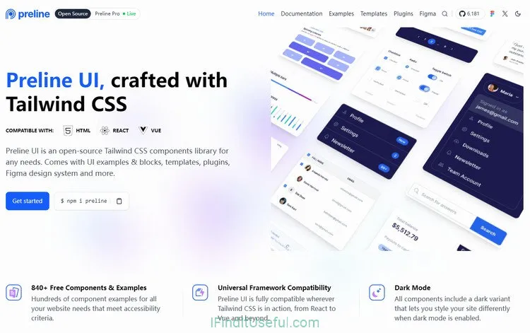
Preline UI is a real gem for Tailwind CSS users. It’s a huge library of open-source components like forms, cards, modals right at your fingertips. Most of these components are pure HTML with Tailwind classes, which means you can just copy, paste, and go, except for some interactive elements like dropdowns, modals on whose pages you’ll find detailed JavaScript implementation notices and guides. Seriously, it’s that easy to integrate into your project without any complext framework wrestling or build setup.
Preline UI documentation is well-organized and straightforward, making navigation through these components a breeze.
The most standout features is its support of multiple plugins, such as Datatables, Charts, WYSIWYG Editor, Drap and Drop, etc, these plugins gives your app more possibilities. But be informed that additional libraries or packages are required for those plugins and you can find detailed information on each plugin docs page.
Tailwind CSS Version: V4.
Installation:
npm i preline- Using Preline UI:
@import "tailwindcss";

/* Preline UI */
@source "./node_modules/preline/dist/*.js";
@import "./node_modules/preline/variants.css";

/* Plugins */
@plugin "@tailwindcss/forms";- JavaScript: preline.js in preline package for interactive elements near the end of your
<body>tag.
<script src="./node_modules/preline/dist/preline.js"></script>2. Meraki UI
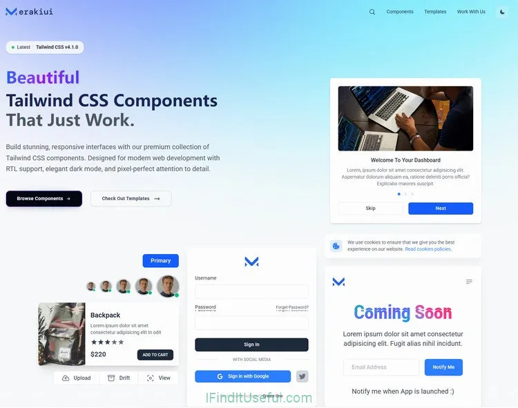
Beautiful free Tailwind CSS components that just work. It has everything you need to build your website fast, like alert, heroes, features, signup forms, CTA, etc.
Build stunning, responsive interfaces with their premium collection of Tailwind CSS components. Designed for modern web development with RTL support, elegant dark mode, and pixel-perfect attention to detail.
One downside of Meraki UI is its collection of components is somewhat limited, I’d hope there be more components in the future for more comprehensive design needs.
Tailwind CSS Version: V4.
Installation: No installation needed.
Using Meraki UI: Just copy and paste code snippets with some interactive elements like dropdowns, tooltips, modals that require AlpineJS.
JavaScript: AlpineJS is require for interactive elements.
3. Pagedone
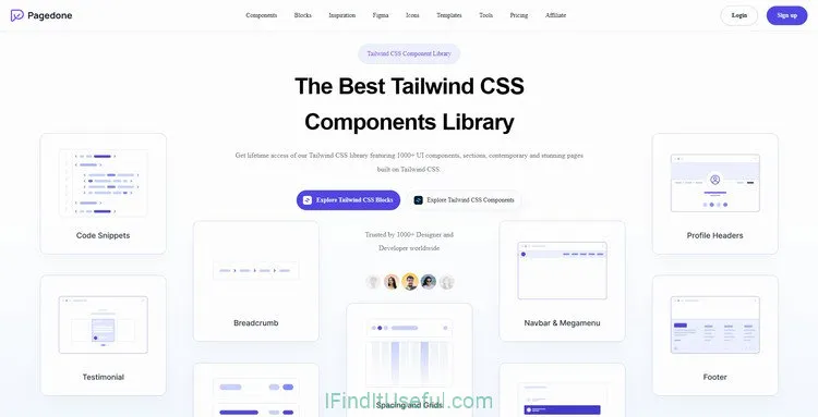
Pagedone is open-source library of 1000+ components, blocks, sections and pages built on top of the utility-classes from Tailwind CSS that are designed to accelerate your web development workflow. It also includes a JavaScript file that makes interactive elements work, such as modals, dropdowns, and more.
Whatever you’re building, Pagedone got you covered, save yourself from investing thousands of hours in building projects from the ground up and recreating identical elements. Pagedone provides all the necessary UI resources for crafting contemporary and stunning UI and web designs.
Tailwind CSS Version: V3, V4
Installation:
npm install pagedone- Using Pagedone:
Require Pagedone CSS inside your <head> tag:
<link href="../path/to/src/pagedone.css" rel="stylesheet"/>Or use CDN
<link href="https://cdn.jsdelivr.net/npm/[email protected]/src/css/pagedone.css " rel="stylesheet"/>- JavaScript: Require Pagedone JavaScript before the end of your
<body>tag:
<link href="../path/to/src/pagedone.css" rel="stylesheet"/>Or use CDN
<script src="https://cdn.jsdelivr.net/npm/[email protected]/src/js/pagedone.js"></script>4. Sailboat UI
Sailboat UI is a modern UI component library for Tailwind CSS. Get started with 150+ open-source Tailwind CSS components, and make it easy to build your products.
Tailwind CSS Version: V3
Installation: No installation needed for Sailboat UI, but you’ll need to install
@tailwindcss/typographyand@tailwindcss/formsplugins.Using Sailboat UI:
- In your
tailwind.config.jsfile:
const defaultTheme = require("tailwindcss/defaultTheme");
const colors = require("tailwindcss/colors");
module.exports = {
  content: ["./src/**/*.{html,js}"],
  theme: {
    extend: {
      // Set font family
      fontFamily: {
        sans: ["Inter", ...defaultTheme.fontFamily.sans],
      },
      // Set theme colors (Required config!)
      colors: {
        primary: colors.blue,
        secondary: colors.slate,
      },
    },
  },
  // Add plugins
  plugins: [require("@tailwindcss/typography"), require("@tailwindcss/forms")],
};- Font: In your project
<head>tag:
<link rel="preconnect" href="https://fonts.googleapis.com" />
<link rel="preconnect" href="https://fonts.gstatic.com" crossorigin />
<link href="https://fonts.googleapis.com/css2?family=Inter:[email protected]&display=swap" rel="stylesheet" />- JavaScript: Sailboat uses AlpineJS. Require JavaScript near the end of your
<body>tag:
<!-- Alpine.js -->
<script src="https://unpkg.com/alpinejs"></script>

<!-- tippyjs -->
<link rel="stylesheet" href="https://cdnjs.cloudflare.com/ajax/libs/tippy.js/6.3.7/tippy.min.css" crossorigin="anonymous" referrerpolicy="no-referrer" />
<script src="https://unpkg.com/@ryangjchandler/[email protected]/dist/cdn.min.js" crossorigin="anonymous" referrerpolicy="no-referrer"></script>*Note: Sailboat UI is an open source project that hasn’t been updated for over 5 months. And the developers and contributors haven’t responded to github issues since 2024.
Go to Sailboat UI5. Penguin UI
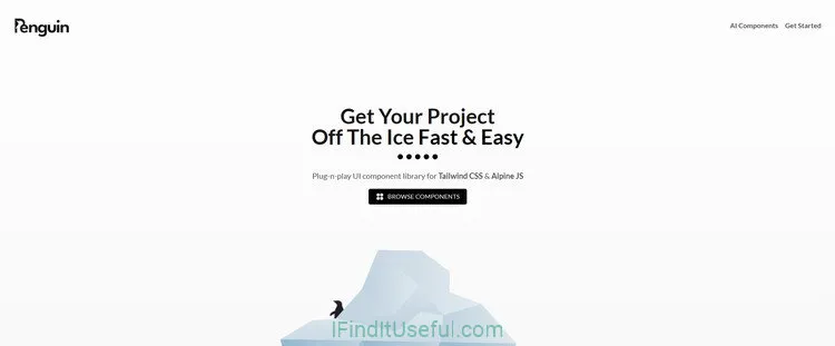
Penguin UI is a really neat pick if you’re building with Tailwind CSS and want to get a polished look fast.
It’s loaded with a variety of well-crafted components – stuff like cards, forms, navigation bars, and more – all provided as straightforward HTML snippets. There’s no clunky framework integration, no package installation, which is a huge time-saver.
Penguin UI components and themes support dark mode out of the box. Just like the rest of the colors, you can edit every single color in the dark mode palette.
Penguin UI is super easy to use with a ton of customization options, out of the box accessibility features, responsiveness, and cross-browser support, to make sure that you can turn your ideas into reality faster and easier.
Tailwind CSS Version: V4
Installation: No installation needed!
Using Penguin UI: Just copy the code snippets and paste them into your project, with AlpineJS required for a few interactive elements.
JavaScript: Install AlpineJS V3 near the end of your
<body>tag - remember to change3.x.xto your desired version.
<script defer src="https://cdn.jsdelivr.net/npm/[email protected]/dist/cdn.min.js"></script>6. ReadymadeUI
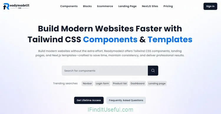
ReadymadeUI is a collection of ready-to-use Tailwind CSS components, blocks, and eCommerce templates that help developers and designers create modern websites more quickly.
ReadymadeUI offers a huge collection of components, spanning everything from basic buttons and cards to more complex forms, modals, and navigation elements, all delivered as clean HTML snippets. The real win here is just how easy it is to grab a component’s code, paste it into your project, and have it integrate seamlessly with your existing Tailwind setup – zero complex framework glue required. Many components also come with straightforward Vanilla JavaScript for added interactivity, making dynamic features accessible without a headache. It’s all about getting that polished, professional look and feel up and running efficiently.
Tailwind CSS Version: V4
Installation: No installation needed.
Using ReadymadeUI: Just navigate to the component you feeling like using, copy HTML and JavaScript code snippets, paste them into your project and you are good to go.
JavaScript: All interactive elements come with Vanilla JavaScript code snippets, which makes using it extremely easy, convenient, and hassle-free.
7. Tailwind Stamps
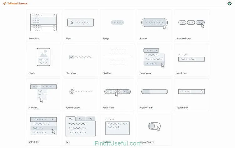
Tailwind Stamps is a utility-first CSS framework that enables developers and designers to create visually appealing websites and applications without writing a single line of custom CSS.
If you’re building with Tailwind CSS and want to grab some ready-made pieces to speed up your work, Tailwind Stamps (over at 5balloons.info) is a useful find. It’s basically a collection of free UI components and elements that are quite like native elements and are ready to go.
Tailwind CSS Version: V3
Installation: No installation needed!
Using Tailwind Stamps: Just navigate to the component you feeling like using, copy HTML and JavaScript code snippets, paste them into your project and you are good to go.
JavaScript: Some interactive elements require AlpineJS to work, and a label
Uses AlpineJSwill place beside the component’s name.
Copy and Paste Code Snippets
These UI kits and components libraries provide collections of UI components all in pure HTML or JSX snippets without having any JavaScript needed, which means there’s nothing to set up or install, all you have to do is grab what you need and paste them into your own projects. It’s easy work done.
1. HyperUI
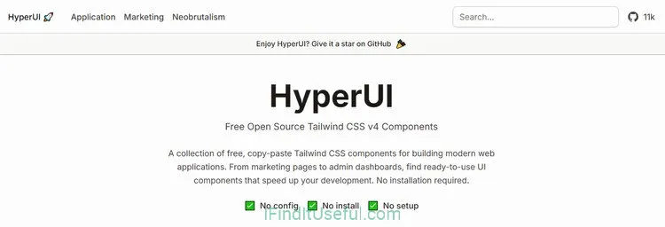
HyperUI is a collection of free open-source, copy-paste Tailwind CSS v4 components library for building modern web applications. From marketing pages to admin dashboards, you’ll find ready-to-use UI components that speed up your development. No installation required.
Tailwind CSS Version: V4
Installation: No installation needed!
Using HyperUI: Just copy and paste the components’ snippets, and you are good to go.
JavaScript: No JavaScript needed!
2. Prebuiltui
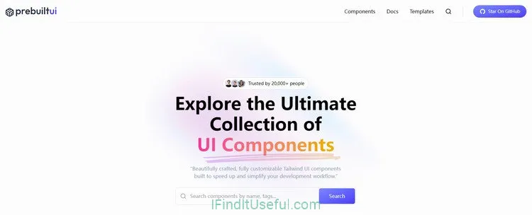
PrebuiltUI is the ultimate collection of ready-to-use beautifully crafted, fully customizable Tailwind CSS UI Components built to speed up and simplify your development workflow.
PrebuiltUI offers clean, responsive and customizable UI components to help you build faster with beautiful designs — without writing extra CSS.
Key Features:
- Easy to Use: All components are written using pure Tailwind CSS.
- Framework Agnostic: Works with Next.js, React, Vue or plain HTML.
- Fully Customizable: Every component is fully customizable, copy‑paste friendly and free to use.
- Community Driven: Stay connected with the PrebuiltUI community.
PrebuiltUI is free for commercial and personal use.
Tailwind CSS Version: V4
Installation: No installation needed!
Using HyperUI: Just copy and paste the components’ snippets, and you are good to go.
JavaScript: Even though PrebuiltUI doesn’t provide any JavaScript code snippets or state where JavaScript is needed, you might still need to implement your own JavaScript logic for some interactive components to work properly, especially in frameworks like ReactJS.
3. Mamba UI
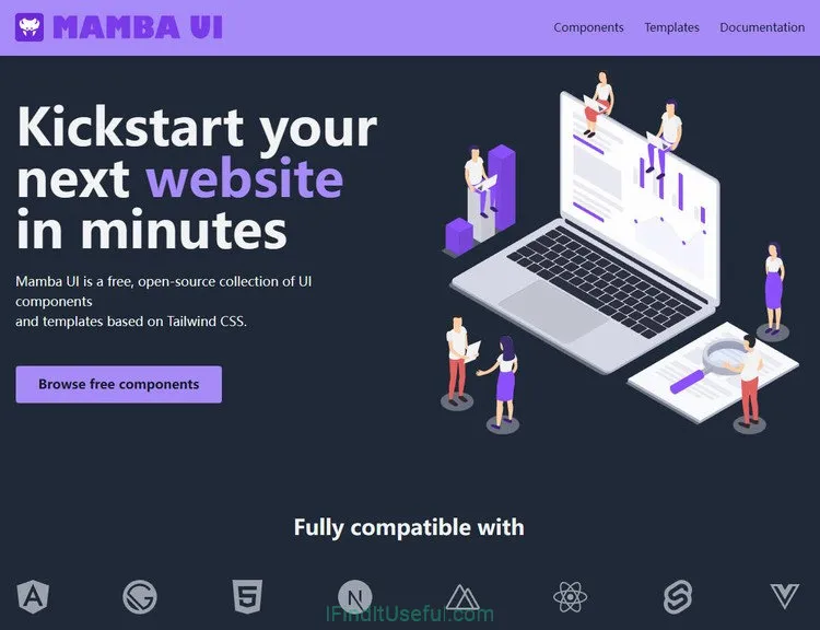
Mamba UI is a free, open-source collection of UI elements and templates based on Tailwind CSS that make it easy for anyone to build a website in minutes. Whether you’re looking to create an e-commerce website or a personal blog, we have all the elements you need to get started right away.
Mamba UI Key Features:
- Easy to use UI elements based on Tailwind CSS
Mamba UI is a toolkit for developers and designers to make creating interfaces easier. We have some of the most popularly used components to help you get started. Everything is modular and customizable to fit your brand. From blogs to portfolios to online stores, you can quickly create a variety of layouts that look great on any screen.
- Zero Design Skills Required
We know it’s frustrating to find an UI kit with all the right components and then find out that each element costs money, so we’re offering 150+ building blocks for free. And there are many more on the way!
- Stop wasting time with CSS
What used to take hours, can now be done in a few clicks. Just copy-paste the code from Mamba UI into your project, add your own content and hit publish. You don’t have to be a professional designer or developer to create something beautiful.
Tailwind CSS Version: V4
Installation: No installation needed!
Using HyperUI: Just copy and paste the components’ snippets, and you are good to go.
JavaScript: No JavaScript needed!